The most common nonlinear scale for plots is probably the “log” scale which shows order of magnitude changes as constant visual differences. It’s so important, that we have several named visualization functions that automatically use log scales:
Eventually we started adding a ScalingFunctions option to visualization functions for two reasons. The first reason is that adding named functions scales poorly, and we would end up with things like LogLinearLogPlot3D. The second reason is to allow more possible scaling functions, beyond just log and linear scales.
There are two parts to how scaling functions work: the visual transformation of the geometry, and the corrected display of tick labels so the plot can be easily read.
Over the past few years the number of functions supporting the ScalingFunctions option has greatly increased, to about 80% of all visualization functions:
Data visualization functions are able to directly plot dated values via scaling functions. In the following example we pass ListLinePlot dates and times as the x and y values, and show the sunrise and sunset times for Champaign, IL over the course of a year. (For simplicity it’s ignoring Daylight Saving Time.)
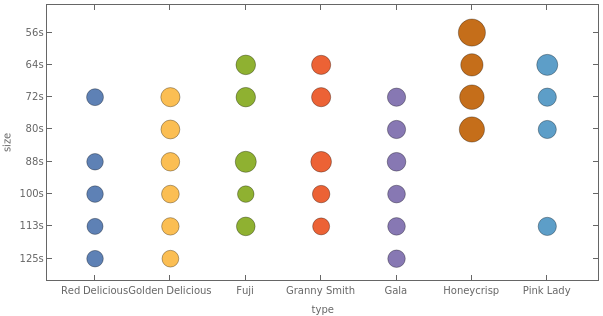
Scaling functions have recently been extended to work with two classes of categorical data: nominal and ordinal.
Nominal data is the most general, and is essentially just a collection of named categories. Examples include people’s names, cities, types of pet, etc...
Ordinal data is similar, but has some concept of ordering between the categories. Examples include things like letter grades in a class, satisfaction levels in a survey, tornado strengths, etc...
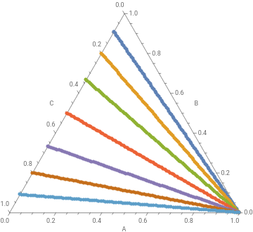
Typically used for mixtures, ternary plots are a way of visualizing data that consists of three components {u,v,w} as 2D points inside a triangle.
TernaryListPlot: Reading Fractions
Interpreting ternary plots can take a bit of practice. In the picture below the colored bands each represent a fixed fraction of component A in the data. The green points, for example, represent all the points where 30% of the mixture is from component A. Where the points are on the right edge of the triangle, component B makes up the remaining 70%. Along the bottom edge, component C does, and the interior corresponds to points with everything in between.
There are also lines corresponding to fixed ratios between components. In the picture below the colored bands each represent a fixed ratio of component B to component C. The yellow points, for example, represent all the points where the ratio is 4:1.

 ,
,
 ,
,
 ,
,