Analysis and Visualization of Cholera Case Data from the 1854 Outbreak
Author
Roman Parker
Title
Analysis and Visualization of Cholera Case Data from the 1854 Outbreak
Description
Using John Snow's data from the 1854 Cholera outbreak, we can apply modern statistical and spatial techniques to verify his analysis and discover new insights.
Category
Essays, Posts & Presentations
Keywords
Cholera, Spatial Statistics, SpatialMedian, Geography, Disease, Epidemiology
URL
http://www.notebookarchive.org/2021-06-399dr3p/
DOI
https://notebookarchive.org/2021-06-399dr3p
Date Added
2021-06-07
Date Last Modified
2021-06-07
File Size
4.41 megabytes
Supplements
Rights
Redistribution rights reserved

Analysis and Visualization of Cholera Case Data from the 1854 Outbreak
Analysis and Visualization of Cholera Case Data from the 1854 Outbreak
Roman Parker
Intern, Wolfram Research Inc
In 1854, there was a major cholera outbreak in Soho, a neighborhood in London. At the time, germ theory was still being developed and disease transmission was not well understood; so the cause of the outbreak was unknown. However, John Snow, a physician known for his work with anaesthetics, managed to trace the outbreak back to a water pump on Broad Street, which was contaminated by a nearby cesspit. He did this by mapping the locations of cholera cases, and then comparing the infected cases near the Broad Street Pump with that of other neighborhoods . This was a major point in the favor of germ theory and helped convince many scientists that cholera spreads through contaminated water. We still have John Snow’s data on the infected cases and their location in the Soho neighborhood. In this computational essay, I will explore this data with modern statistical techniques.
Data
Data
The following data contains 322 buildings (locations) in the region which, according to John Snow, contained infected individuals (i.e. cases). Additionally, the data includes the number of cases at each location (Cases), how far each location was from the Broad Street Pump (DistanceToContaminatedPump) and the nearest uncontaminated pump (DistanceToNonContaminatedPump). The data also contains information on whether the Broad Street Pump or an non-contaminated pump was the closest to the location (ContaminatedPumpClosest).
Define the spatial point data:
In[]:=
sp=SpatialPointData
,
;
Rectangle[ |
Show a summary of data:
In[]:=
sp["Summary"]
Out[]=
|
Define the location of the Broad Street Pump (contaminated pump) and other pumps (non-contaminated ones) in a manner compatible with the data:
In[]:=
contaminatedPump={529399,181012.4};nonContaminatedPumps=
;
LocationOfNonContaminatedPumps |
The data does not directly use latitude-longitude coordinates, so the coordinates of the pumps must be scaled appropriately. Currently, I know of no formula to do this, so I found the locations by comparing a map scaled to these coordinates and a map of London.
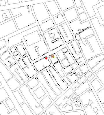
Plot infected locations (with the Broad Street Pump in red and non-contaminated pumps in green) on a map of the area:
In[]:=
map=GraphicsEdgeForm ,FaceForm[],
;pumps=GraphicsEdgeForm ,
, ,Disk[contaminatedPump,10],
 ,Disk[#,10]&/@nonContaminatedPumps;cases=Graphics[Riffle[Table[PointSize[0.015],Length[sp["Points"]]],Point[sp["Points"]]]];Showmap,pumps,cases,
BuildingPolygons |
Options |
Out[]=

Note that the black dots are locations (houses) with some cases (one or more), the red dot is the location of contaminated pump, and the green ones are non-contaminated pumps.
Show the available annotations:
In[]:=
Column[sp[{"Annotations","Keys"}]]
Out[]=
Cases |
ContaminatedPumpClosest |
DistanceToContaminatedPump |
DistanceToNonContaminatedPump |
ContaminatedPumpClosest is Boolean, where True means the contaminated pump was the closed pump, and False means closest pump was non-contaminated.
Data exploration
Data exploration
In this dataset, each household (represented by a point) contains at least one case of cholera. Some locations do contain more, however. Below, we show a histogram of the number of these cases to show the proportion.
Plot the distribution of cases per location:
In[]:=
Histogramsp["Annotations"]["Cases"],
Options |
Out[]=

Fit the case counts to a curve and plot it:
In[]:=
edist=EstimatedDistribution[sp["Annotations"]["Cases"],LogSeriesDistribution[a]]
Out[]=
LogSeriesDistribution[0.658602]
In[]:=
Show[Histogram[sp["Annotations"]["Cases"],{.5,20.5,1},"PDF"],DiscretePlot[PDF[edist,x],{x,1,10,1}]]
Out[]=

In[]:=
DistributionFitTest[sp["Annotations"]["Cases"],edist,"ShortTestConclusion"]
Out[]=
Do not reject
The data follows a negative exponential progression. It could be speculated that it is due to the fact that the population per building distribution approximately follows this distribution, assuming the same infection rate per building, on average.
As seen earlier, this dataset also includes the distance to the nearest non-contaminated pump and to the Broad Street Pump, which we will explore below.
As seen earlier, this dataset also includes the distance to the nearest non-contaminated pump and to the Broad Street Pump, which we will explore below.
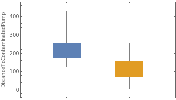
Create a distribution chart of the non-contaminated and contaminated pump distances:
In[]:=
With{data=Query[{"DistanceToNonContaminatedPump","DistanceToContaminatedPump"}][sp["Annotations"]]},DistributionChartdata,ChartLegendsKeys[data],
Out[]=
 |
|
This chart shows that, since there are more non-contaminated pumps, the maximum distance to them is lower. Cases are, on average, closer to the contaminated pump and the minimum value of DistanceToContaminatedPump is lower than that of DistanceToNonContaminatedPump, though.
Show how the cases are distributed in space:
In[]:=
hstgm=SmoothDensityHistogramFlatten[(*DuplicateeachpointinSPbasedonthenumberofcasesthere*)Table@@#&/@Thread[{sp["Points"],sp["Annotations"]["Cases"]}],1],Automatic,"Intensity",
;Show[hstgm,map,pumps]
Out[]=
 |
This smooth density histogram counts the cases at each location and creates a “density map” of the amount of cases in that area. This shows us that the largest case “hotspot” takes the shape of an elongated oval approximately centered on the Broad Street Pump and oriented at about a 45 degree angle from the streets. Additionally, almost all areas with a density above 0.05 are near the contaminated pump. This provides additional evidence that the Broad Street Pump is the cause of the cases.
Show which points are closer and which are farther from the contaminated pump:
In[]:=
cases=ListPlotGroupBy[Thread[{sp["Points"],sp["Annotations"]["ContaminatedPumpClosest"]}],LastMost,Flatten[#,1]&],
;Showmap,pumps,cases,
Options |
Out[]=
 |
|
Plot how many points are at each distance from the contaminated and the closest non-contaminated pump:
Module{data1=GroupBy[Transpose[{sp["Annotations"]["ContaminatedPumpClosest"],sp["Annotations"]["DistanceToContaminatedPump"]}],FirstRest,Flatten],data2=GroupBy[Transpose[{sp["Annotations"]["ContaminatedPumpClosest"],sp["Annotations"]["DistanceToNonContaminatedPump"]}],FirstRest,Flatten]},LegendedRowBoxWhiskerChartValues@data1,
," ",BoxWhiskerChartValues@data2,
,
Placed[ |
Out[]=
  | |||||
|
Note that in above figures, the inter-quartile ranges do not overlap. Strangely enough, it appears that some cases used the Broad Street pump (contaminated one) in spite of having a shorter distance to a non-contaminated one. Perhaps the roadways made it easier to get to the Broad Street Pump or they were in the area for another reason?
Now, we will attempt to find where the source of the cholera outbreak came from. First, the spatial median is calculated. Then, we will calculate how important the relative distance to the Broad Street pump is compared to an non-contaminated pump in affecting cases.
We will do most of this analysis using both unweighted data and the data weighted by the number of cases at the location and with different spatial measures. It is very likely that weighting by cases gives a more accurate picture of where the hotspots of cases are. However, it is less likely to detect a phenomenon which happens rarely. On the other hand, not weighting will detect things like that, but will easily be skewed by outliers.
A similar analysis, using Kernel Density Estimation and Network-Based Scan Statistics, was completed in 2015 in "The mortality rates and the space-time patterns of John Snow's cholera epidemic map" (https://www.ncbi.nlm.nih.gov/pmc/articles/PMC4521606/).
Find the weighted spatial median of the case data:
In[]:=
weightedSpatialMedian=SpatialMedian[WeightedData[sp["Points"],sp["Annotations"]["Cases"]]];
Here, we calculate the SpatialMedian of the data, but weigh it by the number of cases at the location, while below, the data is left unweighted.
When we weigh the data, the spatial median will be more related to the locations of the cases. This is because areas with very few cases won't influence the data as much and case hotspots will provide more of an influence.
When the data is left unweighted, the spatial median is more related to the range and locations of the data, since a location with only one case on the edge will provide as much as an influence as a location with twenty cases towards the center.
The spatial median location minimizes the distance to each case location. Therefore, if the cases were primarily stemming from a single source, it would be likely that the source is near the spatial median. This makes it useful to identify an area to examine more closely for possible sources.
Note: Unless otherwise specified, the default distance function is EuclideanDistance (or GeoDistance for geospatial data).
Note: Unless otherwise specified, the default distance function is EuclideanDistance (or GeoDistance for geospatial data).
Find the unweighted spatial median:
In[]:=
unweightedSpatialMedian=SpatialMedian[sp];
Plot the location of the spatial medians (using EuclideanDistance) with the cases:
In[]:=
cases=ListPlot{sp["Points"],{weightedSpatialMedian},{unweightedSpatialMedian},{contaminatedPump}},
;Showmap,cases,
Options |
Out[]=
 |
|
Let us try different distance functions to calculating spatial median.
Find spatial median using different distance function:
In[]:=
spList={SpatialMedian[sp["Points"],DistanceFunction#]}&/@
;
DistanceFunctions |
Plot the location of the unweighted spatial medians using different distance functions with the pump location and the cases (Note: some of the spatial median locations overlap):
In[]:=
RowShowmap,ListPlot{sp["Points"],{contaminatedPump}},
,ListPlotspList,
,
," ",Showmap,ListPlot{sp["Points"],{contaminatedPump}},
,ListPlotspList,PlotMarkersAutomatic,PlotLegends
,
Rule[ |
Rule[ |
Rule[ |
DistanceFunctions |
Out[]=
 |
|
The spatial medians, whether weighted, unweighted, or with different distance functions, are near to the location of the Broad Street Pump and to each other (see above visualizations). This tells us that the amount of cases at a location is approximately rotationally symmetric around the spatial median. Otherwise, the unweighted spatial median would be quite different than the spatial median.
Additionally, looking at above visualization, it appears that the case locations are more common towards the center of the data. This provides some level of anecdotal evidence that there is a single source to the data.
Show a smooth density histogram of the data weighted by the number of cases at that location:
In[]:=
shstrgm=SmoothDensityHistogramFlatten[(*DuplicateeachpointinSPbasedonthenumberofcasesthere*)Table@@#&/@Thread[{sp["Points"],sp["Annotations"]["Cases"]}],1],Automatic,"Intensity",
;Show[shstrgm,map,pumps]
Out[]=
|
Show a smooth density histogram of the case locations, ignoring number of cases:
In[]:=
ShowSmoothDensityHistogramsp["Points"],Automatic,"Intensity",
,map,pumps
Out[]=
 |
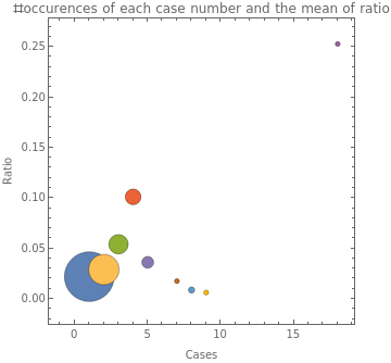
Next, we will calculate how much of an effect being near the Broad Street Pump instead of another pump had on the amount of cases at a location. It may provide additional evidence for the Broad Street Pump being responsible. We calculate a measure which is simply the ratio between DistanceToNonContaminatedPump to DistanceToContaminatedPump. We would expect that as our number of cases increases, at least up to a point, the value of ratio should also increase, since ratio will get larger as a point gets closer to the Broad Street Pump.
Define ratio:
In[]:=
ratio=Rescale[Divide@@Lookup[{"DistanceToNonContaminatedPump","DistanceToContaminatedPump"}][sp["Annotations"]]];
We now generate our data as follows: {cases per household, average ratio, frequency}. To do that, we first group our dataset based on cases. Then for each category (i.e., each value of cases), we calculate the mean value of ratio for that collection, and also number of household having that number of cases.
In[]:=
bubble=SortBy[KeyValueMap[Flatten[{#1,#2}]&][GroupBy[Thread[{sp["Annotations"]["Cases"],ratio}],FirstRest,{Mean[#],Length[#]}&]],First];
Create a bubble chart showing the number of cases, the mean value of ratio for each amount of cases, and how many instances there are of that number of cases:
In[]:=
BubbleChartList/@bubble,
Out[]=
 |
|
This shows a climb in ratio from one case to four cases, but then it falls off for 5 cases and above, except for the 18 cases. However, there are only 14 locations total with five or more cases, so it is very possible that the values which fall off are not representative of the hypothetical distribution of these points due to them making up less than 5% of the locations.
Next, we will create a BoxWhiskerChart of cases and ratio to see if it shows a similar phenomenon or if it is unique to this one method of visualisation.
Show box whisker charts of ratio for each amount of cases:
In[]:=
With[{data=KeySort@GroupBy[Transpose[{ratio,sp["Annotations"]["Cases"]}],LastMost,Flatten]},BoxWhiskerChart[data,"Outliers",ChartLabelsKeys[data],PlotRange{0,.1}]]
Out[]=
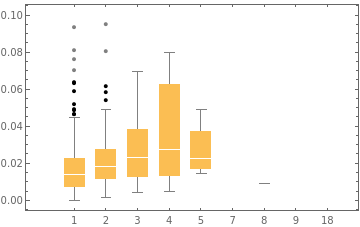
Once again, cases and ratio do seem to rise together up until 5 cases, and although the rise in median seems to be still linear, the 75th percentile seems to grow exponentially, which is interesting. Additionally, the lowest value and 25th percentile continue to rise when there are 5 cases. This suggests that our hypothesis from earlier that the low values are potentially outliers may be correct. However, we still do not have the evidence to prove this, and there very well could be some secondary factor here impacting case numbers. Next, we will test to see if ratio and cases are independent from each other.
Test for independence:
In[]:=
IndependenceTest[ratio,sp["Annotations"]["Cases"],"TestConclusion"]
Out[]=
The null hypothesis that the populations are independent is rejected at the 5 percent level based on the Spearman Rank test.
Showing a lack of independence just provides another piece of evidence that ratio, and therefore the distance to the Broad Street pump and other pumps, is related to cases. Between all the visualizations and data analysis, we can say that the Broad Street Pump seems more likely to be related to the cholera outbreak, while the other pumps are significantly less likely.
Acknowledgements
Acknowledgements
I would like to thank Mads Bahrami for his input on the notebook revisions and Gosia Konwerska for providing the data and helping to improve the essay.
Vocabulary
Vocabulary
BoxWhiskerChart[{x1, x2, x3, ...}] | Create a box-whisker chart of the data. |
BubbleChart[{{x1, y1, z1}, {x2, y2, z2}, ...}] | Create a bubble chart with bubbles at {x,y} with size z. |
DiscretePlot[v, {i, min, max, step}] | Plot the values of v iterated across the values of i. Similar to ListPlot[Table[v[i], {i, min, max, step}]]. |
DistributionChart[{dataList1, dataList2, ...}] | Creates a distribution chart (also known as a violin plot) which shows the values and frequency of values in each of the datasets. |
DistributionFitTest[data] | Checks if data is normally distributed. |
GroupBy[list, function] | Groups the values of list into an association where the key is each value of function when applied to the list and the value is a list of each element of list which has that value when function is applied to it. For example GroupBy[{-5, -4, 0, 1, 3, 5}, Sign] would return -1{-5,-4},0{0},1{1,3,5}. Similar to GatherBy, except it also gives the value returned by the function, and similar to SortBy, except SortBy puts the elements in canonical order based on the function rather than creating an association of each value returned by the function. |
IndependenceTest[l1, l2] | Checks if the two lists (interpreted as vectors or matrices) are independent. |
PDF[distribution, value] | Finds the probability of a distribution returning a value. |
Riffle[{x1, x2, x3, ...}, {y1, y2, y3, ...}] | Interleaves the two lists. For example Riffle[{1, 3, 5}, {2, 4, 6}] is {1, 2 ,3 ,4, 5, 6}. |
SmoothDensityHistogram[coordList] | Returns a smooth plot of the density of the x-y coordinates in coordList. |
SortBy[list, function] | Returns a version of list sorted by the order which Sort[function/@list] would return. |
SpatialMedian[data] | Computes the spatial median of the data, which is the point at which the total distance to all points in data is minimum. |
SpatialPointData[data->values, region] | Returns a SpatialPointData object in a region with values/annotations at each point defined by the values list. |
WeightedData[dataList, weightsList] | For most functions, allows for computation of parameters with the data weighted according to weightsList. Occasionally, functions don't support WeightedData, in which case, Flatten[Table@@#&/@Thread[{dataList,weightsList}],1] duplicates each element in dataList based on the corresponding value in weightsList, which only works for non-negative integer weights and doesn't have the same length, but usually works otherwise. |
Cite this as: Roman Parker, "Analysis and Visualization of Cholera Case Data from the 1854 Outbreak" from the Notebook Archive (2021), https://notebookarchive.org/2021-06-399dr3p
Download
